

The challenge & product scope
One reusable product foundation, expressed through the gym’s own brand and member services.
Bring the gym relationship into one branded app
Members need to buy a plan, understand access, manage sessions and keep account details current. Gym owners also need the experience to feel like their own service. The design challenge is to connect these tasks with consistent navigation while supporting distinct gym branding.
- Membership purchase: help a guest understand packages, review a payment plan and become an active member.
- Member services: make access, bookings, messages and account actions easy to locate after login.
- A reusable foundation: retain shared interaction patterns while allowing the gym’s logo, imagery and accent colors to lead the visual identity.

Research & user needs
Understand the decisions behind membership, scheduling and account management before designing the screens.
Start with member and operator needs
The interview material describes five participants and highlights practical needs: buying membership in-app, checking schedules without messaging a trainer, booking sessions, using linked family accounts and preserving a gym’s own branding. These themes become design priorities rather than claims of measured business impact.

Translate the themes into clear priorities
- Reduce repeated questions. Put session information, membership details and the next available action where members expect them.
- Support the household. Keep the active family member visible before switching accounts or making a booking.
- Build confidence at commitment points. Explain plan choices and payment actions before the member confirms.
Competitive analysis & design process
Research informs the structure; flows, wireframes and a reusable UI system turn that structure into a usable experience.
Compare useful patterns, then define the product’s own structure
The supplied review considers Glofox’s customer app and ABC Trainerize across navigation, scheduling, customization and feature complexity. It provides a starting point for evaluating how a branded gym app can stay approachable while supporting a broad set of member tasks.

Move from understanding to interaction detail
- Discover: review comparable experiences and interview themes.
- Define: connect member goals to signup, home, access, bookings and account services.
- Design: establish flows and wireframes before building the high-fidelity interface.
- Refine: use a shared design system and prototype to review states, errors and handoffs.

Information architecture & wireframes
Give each task a clear entry point and keep the return path to the member’s home predictable.
A home screen that connects the core journeys
The flow separates signup and login, then brings users into a common home experience. Gym access, My Bookings, class schedules, training videos and referrals branch from that central point so repeat visits do not require retracing onboarding.

Resolve hierarchy before adding the brand layer
Low-fidelity wireframes explore layout, content priority and navigation before the final visual treatment. The high-fidelity screens reuse familiar cards, account headers, forms and confirmation patterns across different features.

Onboarding & profile setup
Move from a recognizable gym welcome to verified access and a personal home screen.
A focused phone-based entry flow
The opening screen explains memberships and passes, with login/signup and guest paths. Members select their branch, enter a phone number and verify a code. Keeping these steps separate gives each screen one primary decision.

Introduce personal questions progressively
Conversational profile screens collect a name and fitness goals before the home dashboard. Optional prompts and a visible next or skip path keep personal setup from competing with the member’s immediate reason for opening the app.

From guest to active member
A staged purchase flow separates package selection, plan review and payment so members understand the commitment.
- Choose a package. Compare the available membership options before moving to a payment plan.
- Review the plan. Keep duration, plan selection and the purchase summary together.
- Select a payment method. Distinguish saved cards, adding a new card and the final pay action.
- Confirm the outcome. Explain whether the purchase succeeded and how the member can continue to their membership.

A clearer path from app to gym
Connect digital membership and class information to the real-world check-in experience.
The member profile, QR access and training content support the visit after purchase. A class QR card includes the session and venue context, while the home screen brings class discovery and member shortcuts together.
- Access with context. Keep the class or membership identity alongside the QR code.
- Find the next session. Provide clear entry points to class schedules and bookings.
- Continue learning. Training content pairs a recognizable preview with session information.

Health forms & digital signature
Make required paperwork easier to complete and review within the member journey.
Members can open the physical activity readiness questionnaire from their profile, complete the questions and provide a digital signature. The flow keeps the form and its completion action within the same mobile account experience.
- Use readable form groups and explicit response controls.
- Keep the signature action clear, with an option to clear and redraw.
- Show completion and review status so members know what remains.

Family accounts without losing context
One managing account, with clear boundaries between the people and memberships it represents.
Linked accounts support a household member who manages memberships or bookings for others. The account switcher places profiles above the membership list so the current person and the selected membership can be understood together.
- Make the active profile visible before an account change.
- Keep each membership associated with the correct person.
- Provide an explicit switch action to reduce accidental context changes.

Manage sessions from one place
Support the complete booking lifecycle, including scheduled sessions, empty days and feedback.
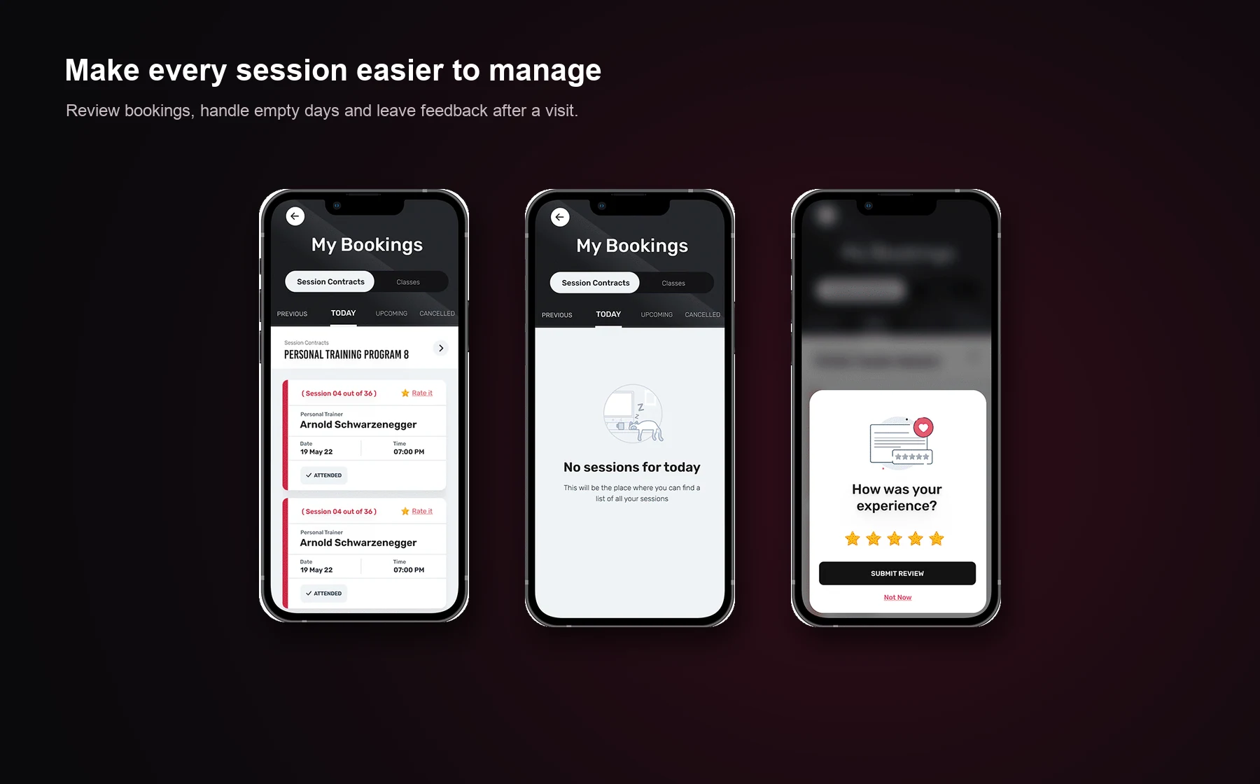
My Bookings separates session contracts and classes, then provides the information needed for an upcoming visit. Empty states explain when there are no sessions for the day. A feedback prompt closes the loop after the experience.
- Review the scheduled activity and its date before taking an action.
- Make cancellation understandable and confirm the affected booking.
- Use empty states to explain what is missing and where to go next.
Refer a friend with a clear next step
Keep invitation details, the send action and confirmation in a connected sequence.
The referral journey moves from a promotional prompt to an invitation form and a submission confirmation. Showing a referral’s state helps the member understand whether an invitation has been sent and what should happen next.
