

The challenge & user needs
Make it easier to discover a suitable fitness option, understand the commitment and maintain a consistent routine.
From scattered tasks to one fitness journey
Choosing a gym often means switching between maps, pricing pages, messaging and separate booking tools. The research themes highlight difficulty comparing memberships, finding nearby venues, locating appointments and sustaining motivation.

Research themes: schedules, local discovery, membership comparison, session visibility and motivation.
- Define the decision. What does someone need to know before choosing a venue, trainer or class?
- Reduce uncertainty. Make nearby options, booking context and membership information easier to find.
- Support follow-through. Keep upcoming sessions, passes and progress accessible after signup.

Research, definition & design process
Use research to decide what belongs in the journey, then build the interface around those priorities.
Compare the complete experience
The competitive review considers Enhance Fitness, ClassPass, Fitze and Mindbody across navigation, onboarding, booking and feature complexity. The design opportunity is to combine useful choice with a simpler path through the marketplace, rather than adding every feature to the first screen.
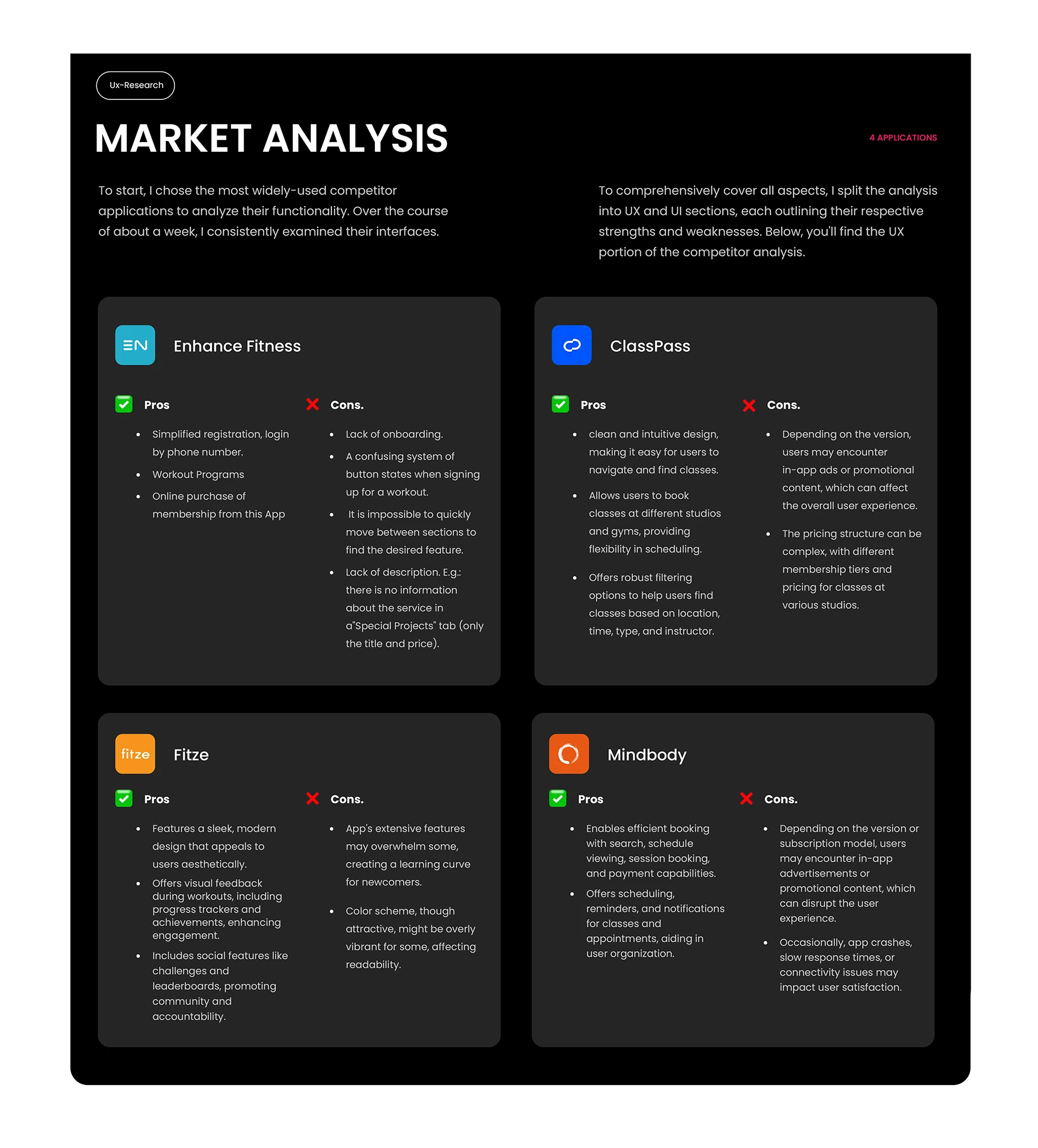
A staged process from research to prototype
- Discover. Review comparable products and translate user concerns into design priorities.
- Define. Group discovery, booking, membership access and engagement into a connected journey.
- Design. Move from flow diagrams and low-fidelity sketches to reusable mobile screens.
- Refine. Review screen states and interaction handoffs before preparing the prototype for task-based validation.

Information architecture & wireframes
Organize the marketplace around what people are trying to do: discover, decide, book, access and stay active.
One home, several clear paths
The flow chart connects onboarding and phone signup to a home experience, with branches for gym memberships, classes and events, gym buddies, sports courts and personal trainers. Check-in, fitness tracking and leaderboards extend the journey beyond the initial booking.

Resolve structure before visual detail
Low-fidelity sketches establish the hierarchy of discovery cards, venue information, profile details and key actions. Repeated navigation patterns then carry through to the high-fidelity screens so people can move between features without relearning the interface.

Onboarding & account setup
A clear first experience moves from understanding the product to creating an account at a comfortable pace.
Introduce value before asking for details
Three welcome screens introduce memberships and passes, broader fitness possibilities and the social network. Join, login and guest options give users a clear entry point without forcing the same commitment on everyone.

A progressive registration flow
- Enter a phone number. Use one familiar identifier to begin login or registration.
- Verify the code. Keep the confirmation step focused and provide a resend path.
- Complete the profile. Separate basic identity from fitness preferences and personal details.
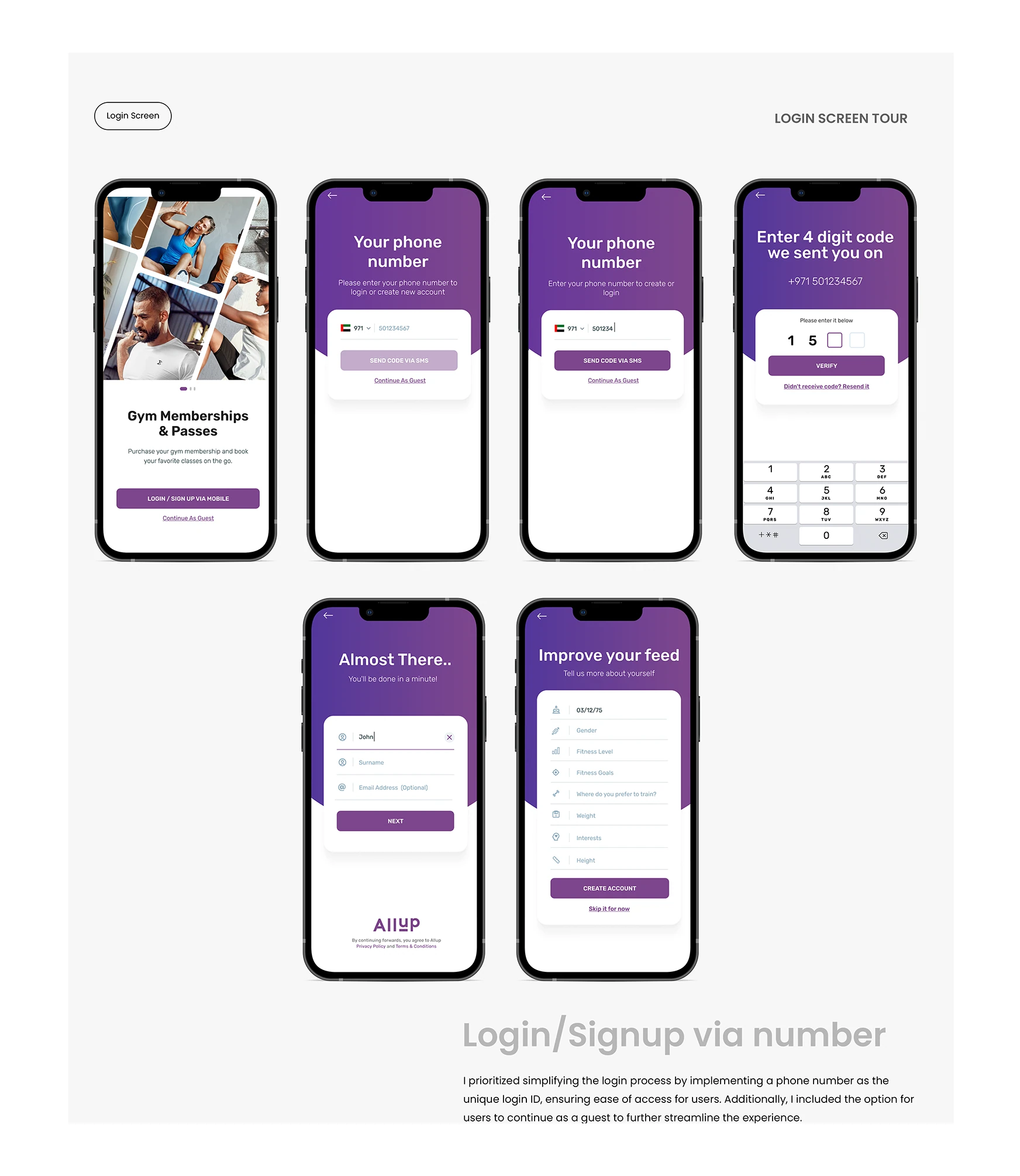
Phone-based registration separates verification, essential identity details and optional profile preferences.
Explain the real-world fitness workflow
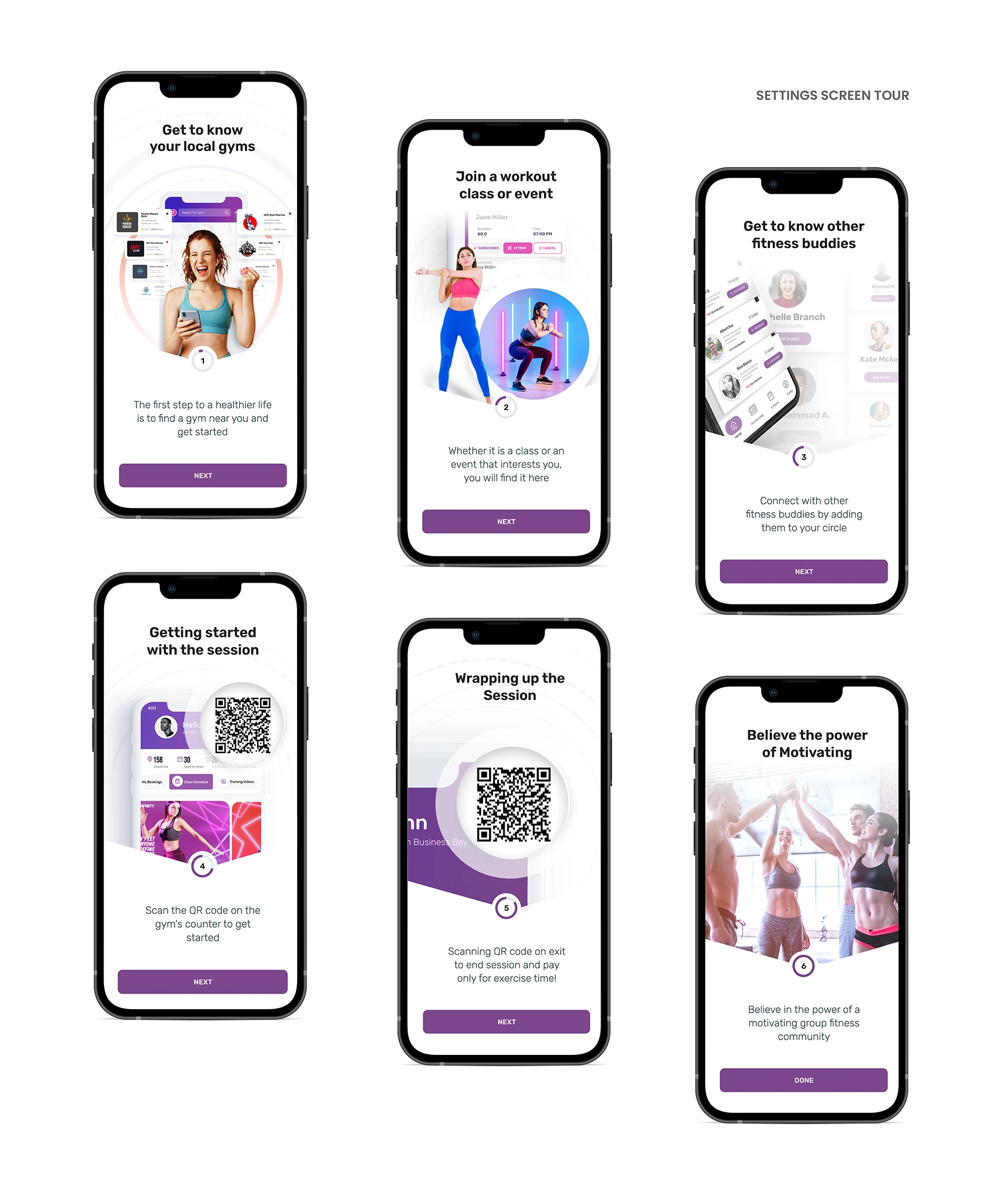
The guided tour introduces local gyms, workouts and events, fitness buddies, QR entry and session completion. It connects digital actions to what happens at the venue, instead of treating onboarding as a list of app features.
Local discovery & trainer selection
Move from “what is nearby?” to “is this right for me?” with practical information at the point of choice.
Explore nearby options in list or map view
Category navigation separates gyms, courts, trainers and classes. Venue cards surface names, location cues, ratings and availability context, while a map view helps users judge what is practical for their routine.

Make trainer selection an informed choice
Trainer discovery leads into a detailed profile with specialties, introductory information, social links and credibility cues. Keeping these details close to the selection flow helps users assess fit before proceeding to booking.

Trainer browsing and detailed profiles bring specialties, social proof and booking context into one path.
Bookings, memberships & venue access
Make the transition from choosing a fitness experience to using it feel continuous.
Keep sessions and membership actions connected
The profile calendar provides a view of scheduled sessions, while package selection organizes membership choices around a clear sequence: package, plan and payment. A digital pass brings the selected venue and access details into a scannable QR presentation.
- Review scheduled activity. See the session and its booking context from the profile calendar.
- Choose a package. Compare visible price and plan information before continuing.
- Access the pass. Present a QR code and venue details when it is time to train.
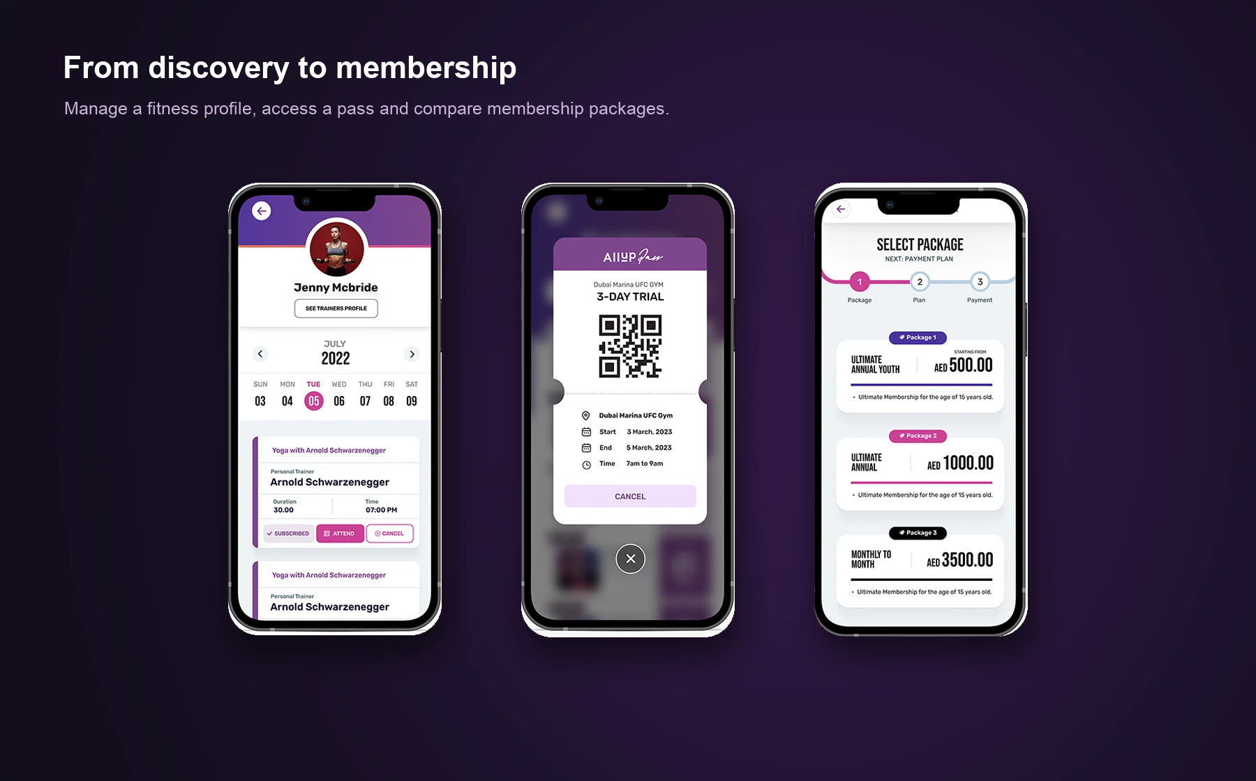
Activity, progress & community
Extend the product beyond a one-time transaction with useful feedback and optional shared goals.
Bring everyday progress into view
The home screen connects discovery with a daily activity summary. A dedicated progress view shows activity measures over time, and connected-device screens make integrations and permissions explicit.

Turn individual progress into shared motivation
Challenges include participation details, a join confirmation and a leaderboard. These states give users a reason to return while keeping the choice to participate visible and deliberate.
