The challenge
One QR code, different guest goals
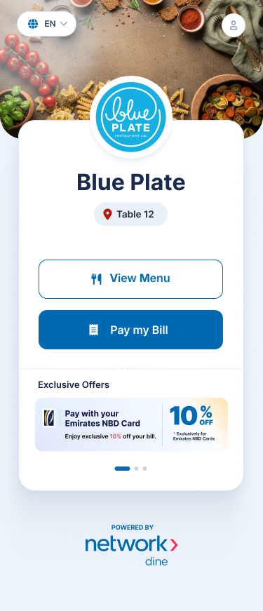
A QR code can be scanned before ordering, midway through a meal, or when a group is ready to leave. The first screen has to tell guests where they are and let them act immediately.
- Table context: The restaurant and table number need to be recognizable before guests act.
- Different entry points: Guests arriving to browse and guests ready to pay should not have to follow the same path.
- Payment confidence: People need to see what they owe and what happened after they pay.
The NI Dine QR approach
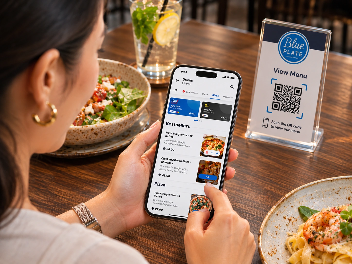
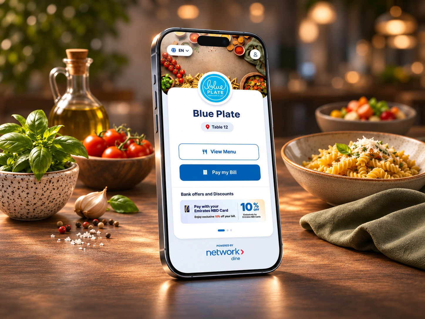
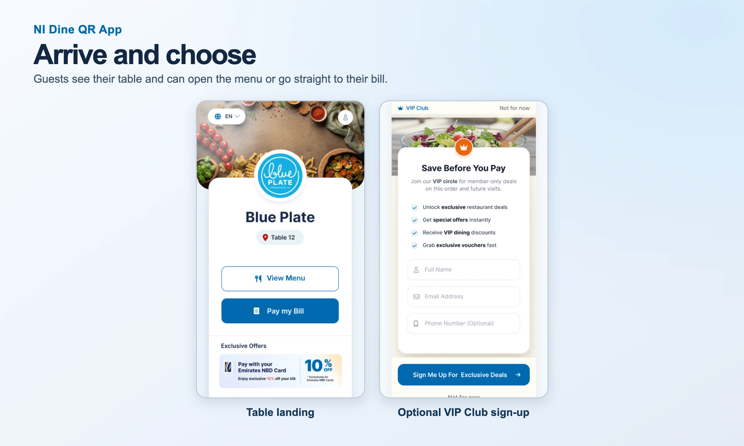
A table-specific landing screen gives View Menu and Pay my Bill equal clarity. The Blue Plate prototype shows how a restaurant’s own identity can sit alongside Network International’s payment experience.
- Browse first: Guests can explore menu sections and view a dish without starting checkout.
- Pay directly: The bill path starts with the current table and an itemized total.
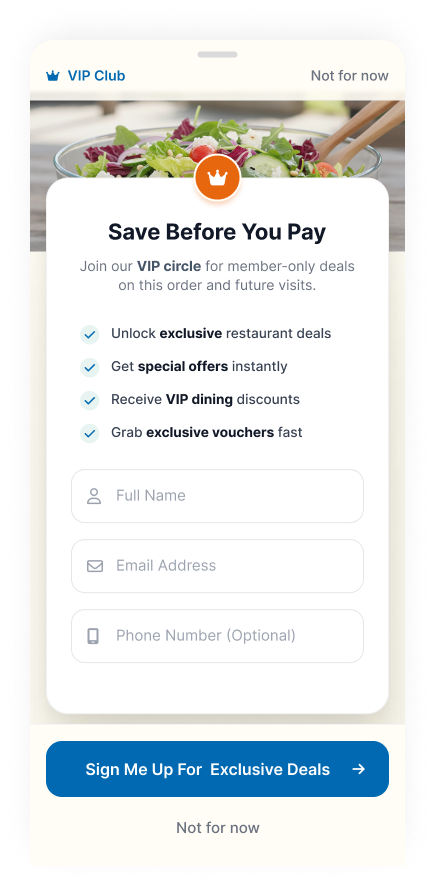
- Keep extras optional: Offers and VIP enrollment are available without forcing a detour in the main flow.
Guest needs & persona
Design for decisions guests make at the table
The design uses a group-dining scenario to surface different needs during the same meal, from a guest checking ingredients to friends deciding how to settle up.
- Find a dish quickly: Make categories and search easy to spot on a phone.
- Check details before adding: Show ingredient, allergen, and modifier information close to the Add action.
- Know what I’m paying: Keep fees, discounts, and the final total visible before payment.
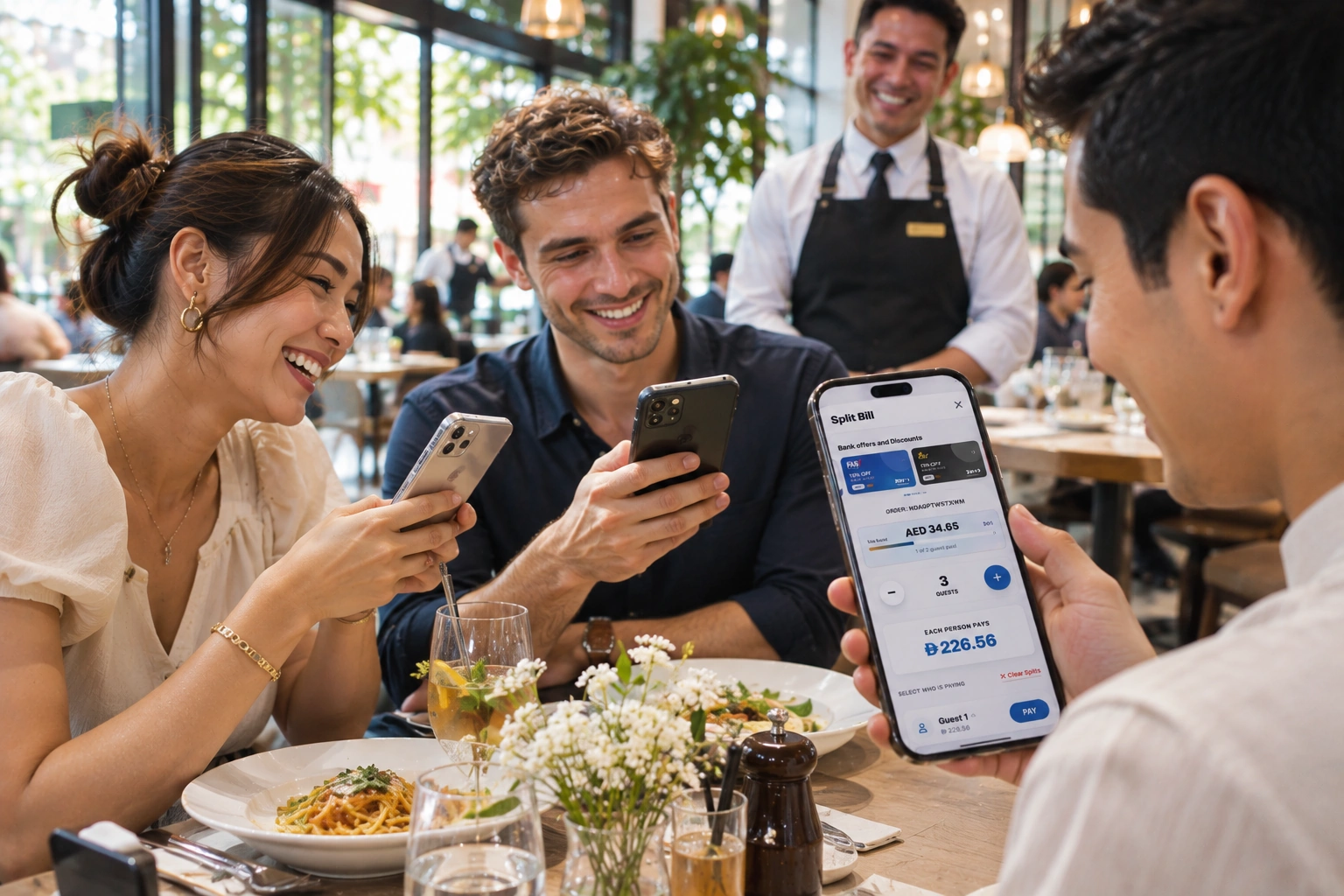
- Make a fair split: Explain the share and show progress while other guests settle their parts.
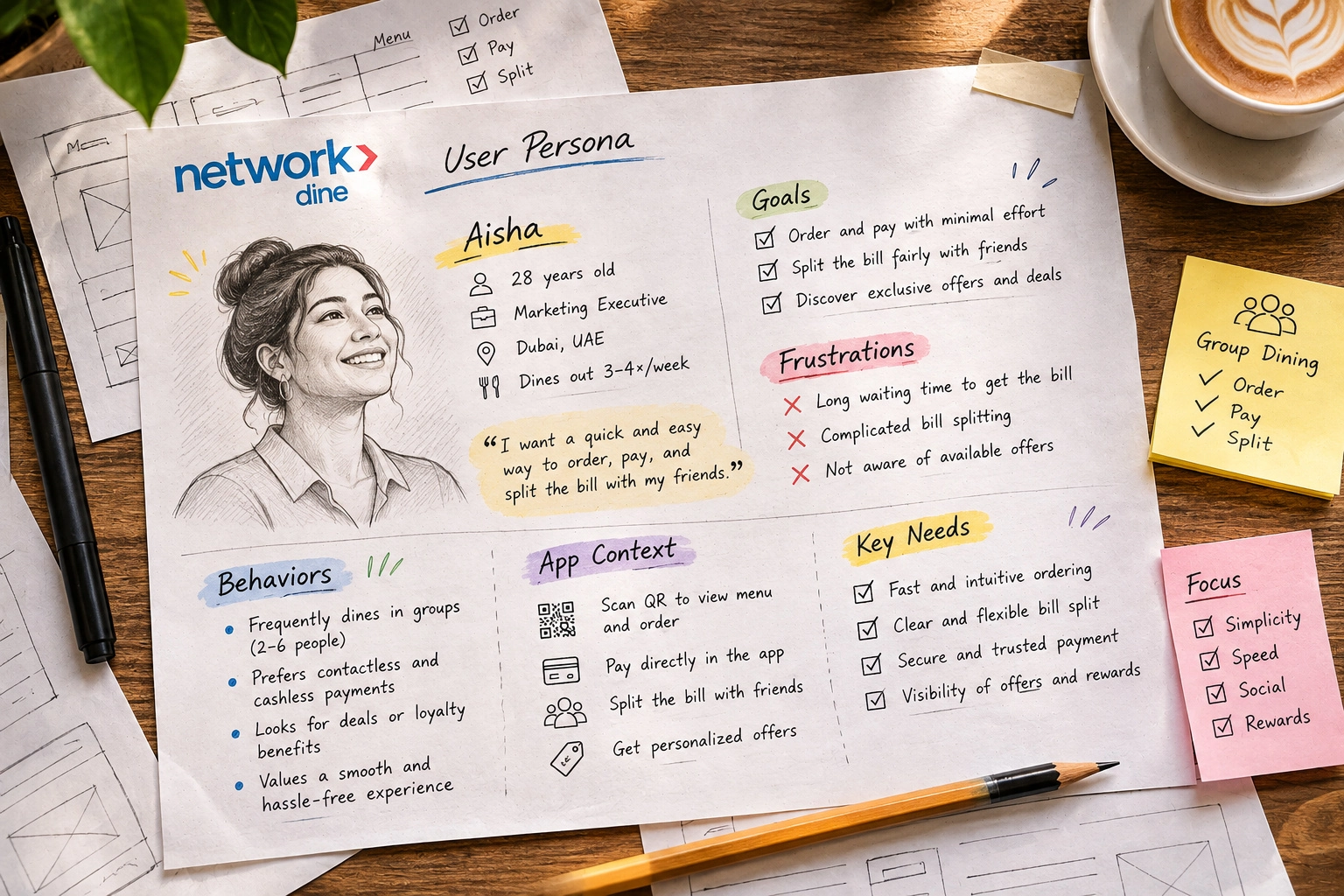
Aisha · Group-dining persona
Aisha is an illustrative Dubai diner who often eats out with friends. Her scenario gives the project a concrete test: can one guest order, another check an offer, and the group still settle with confidence?
- Goals: Find something to order, pay from the phone, and split the bill with friends.
- Friction: Waiting for the bill, unclear totals, and trying to work out everyone’s share manually.
- Design response: Keep offers optional, make payment choices understandable, and let guests recover if the bill is unavailable.
Inspect individual screens (2)
Arrive and choose
Information architecture & customer flow
Separate the two main paths
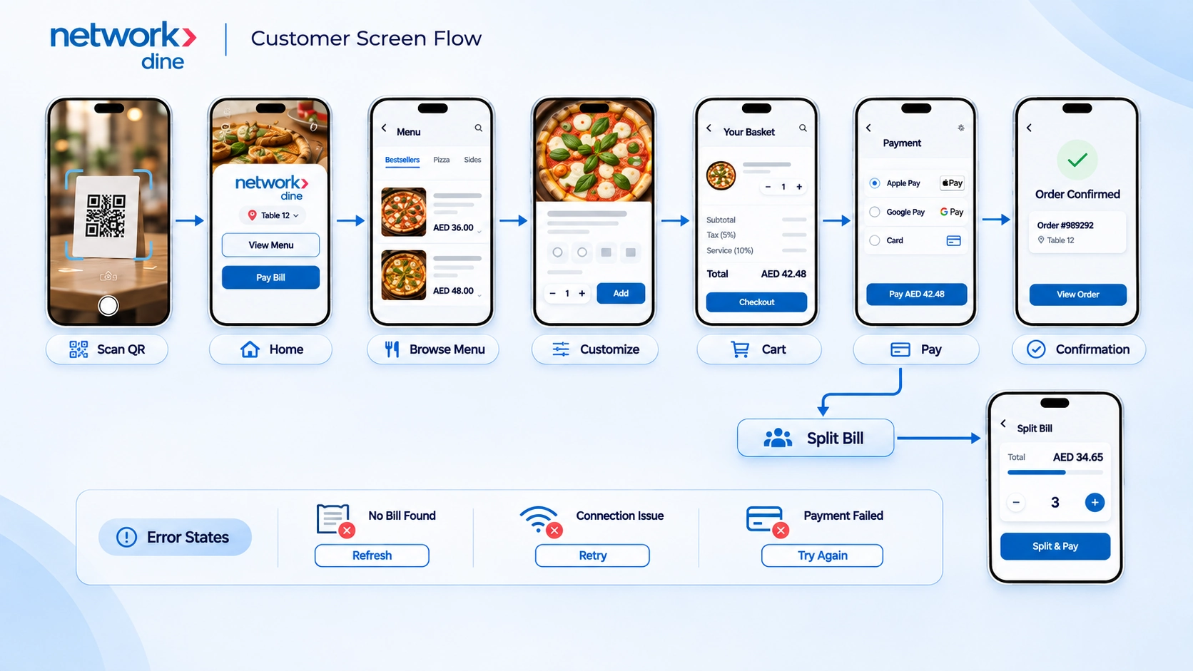
The interaction map starts with the table QR, then branches into a menu-led order journey and a bill-led settlement journey.
- Menu path: Browse or search, inspect the item, make selections, review the basket, and proceed to checkout.
- Bill path: Open the table bill, verify items and charges, then choose full payment or a split.
- After payment: Confirm what happened and provide access to order details or a downloadable record.
Map the return paths alongside the main flow
The customer screen-flow board connects the core screens and shows where payment splits and recovery branch off.
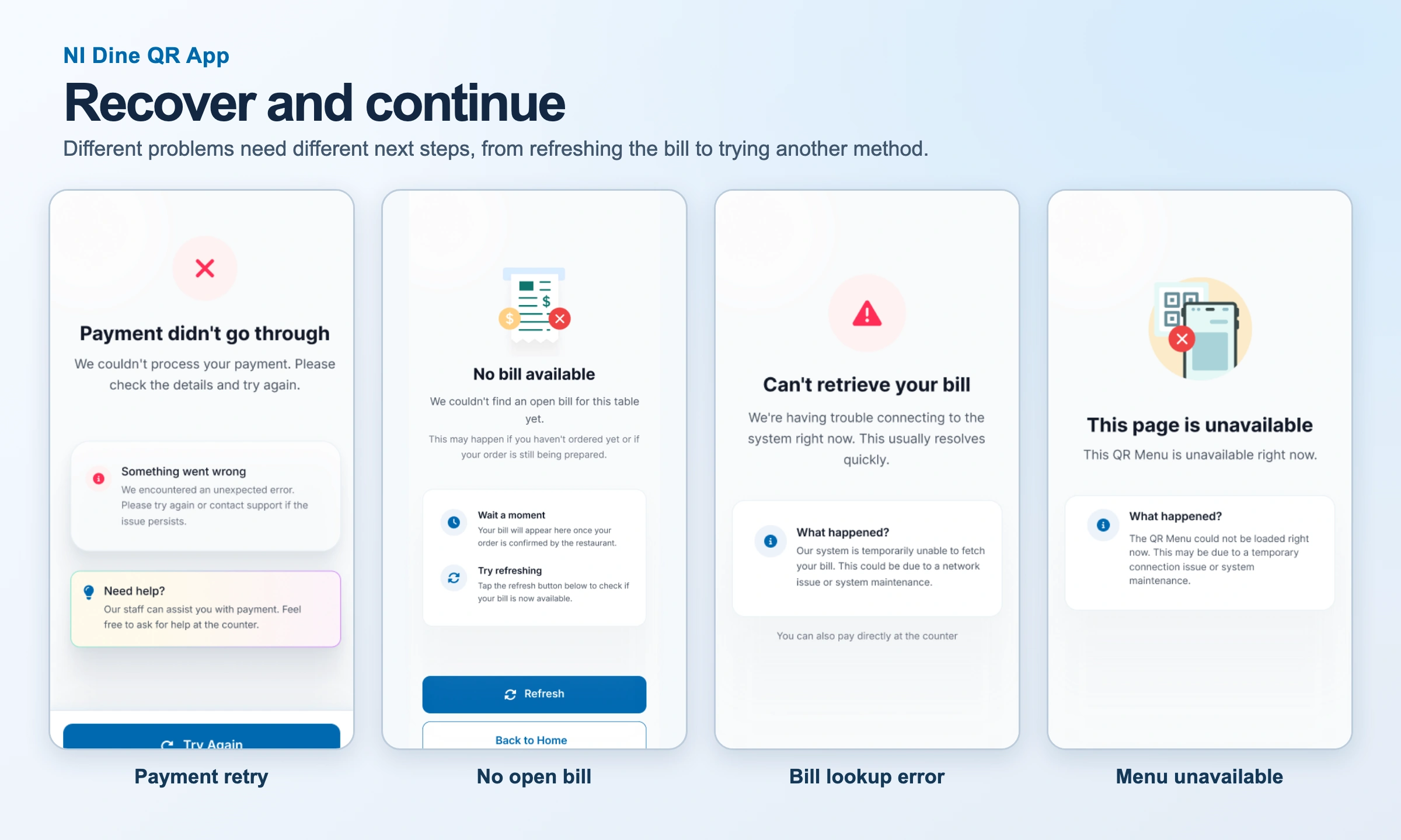
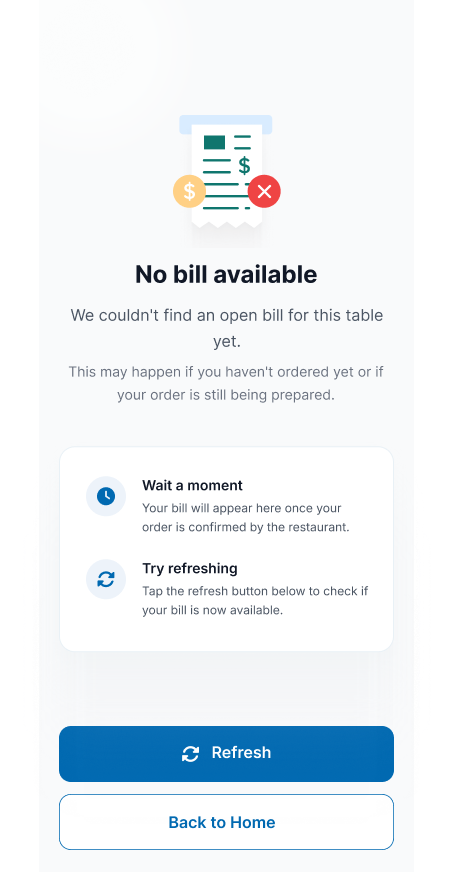
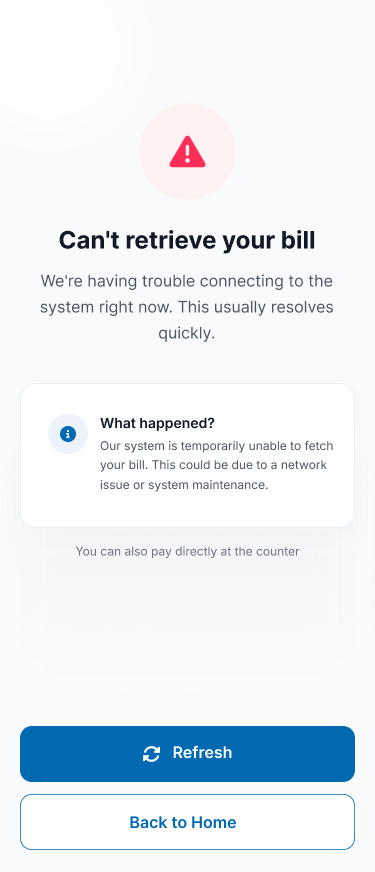
- No bill yet: Explain why a bill might not be open and offer Refresh or Back to Home.
- Connection trouble: Tell guests when the bill cannot be retrieved and show the counter payment option.
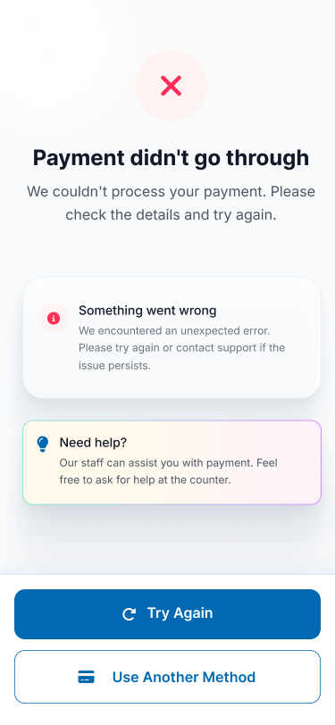
- Failed payment: Offer a retry and another method so the guest can make an informed next move.
Design process
From sketches to an interactive prototype
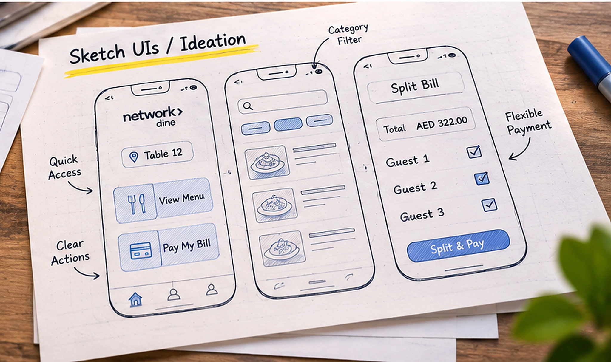
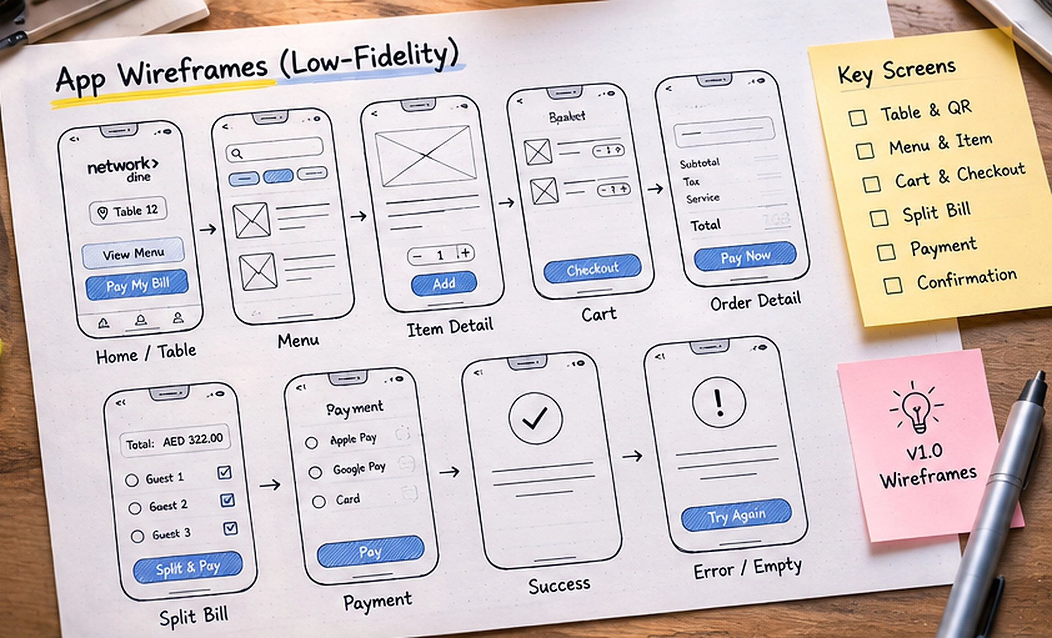
I used a table-to-payment journey to connect the design artifacts and keep the screen sequence tied to the meal.
- Map decisions: Start with the restaurant and table, then identify what a guest needs to browse, order, or settle.
- Sketch alternatives: Explore the hierarchy of the landing screen, category navigation, and split bill.
- Wireframe states: Lay out the basket, totals, payment choice, confirmation, and error states before polishing visuals.
- Prototype the handoffs: Connect the mobile screens so the change from browsing to reviewing to paying can be inspected in context.
Visual hierarchy for a phone at the table
The visual design puts the restaurant identity and table up front, then uses consistent primary actions and itemized summaries as the journey progresses.
- Readable details: Use scannable item names, amounts, and explicit labels for required choices.
- Actions within reach: Keep quantity, Add, checkout, and payment actions close to the decision they confirm.
Browse, customize & order
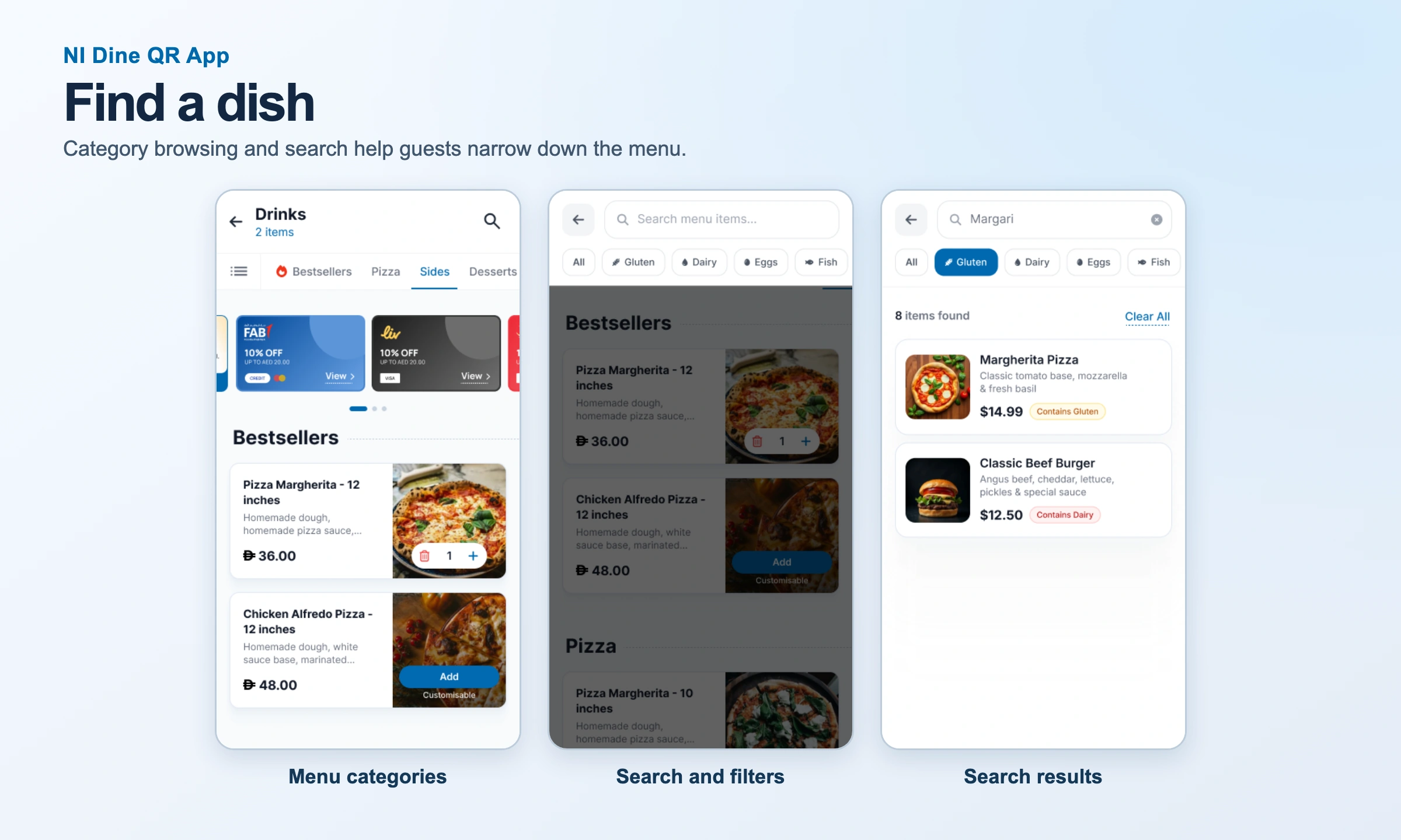
Find the right dish
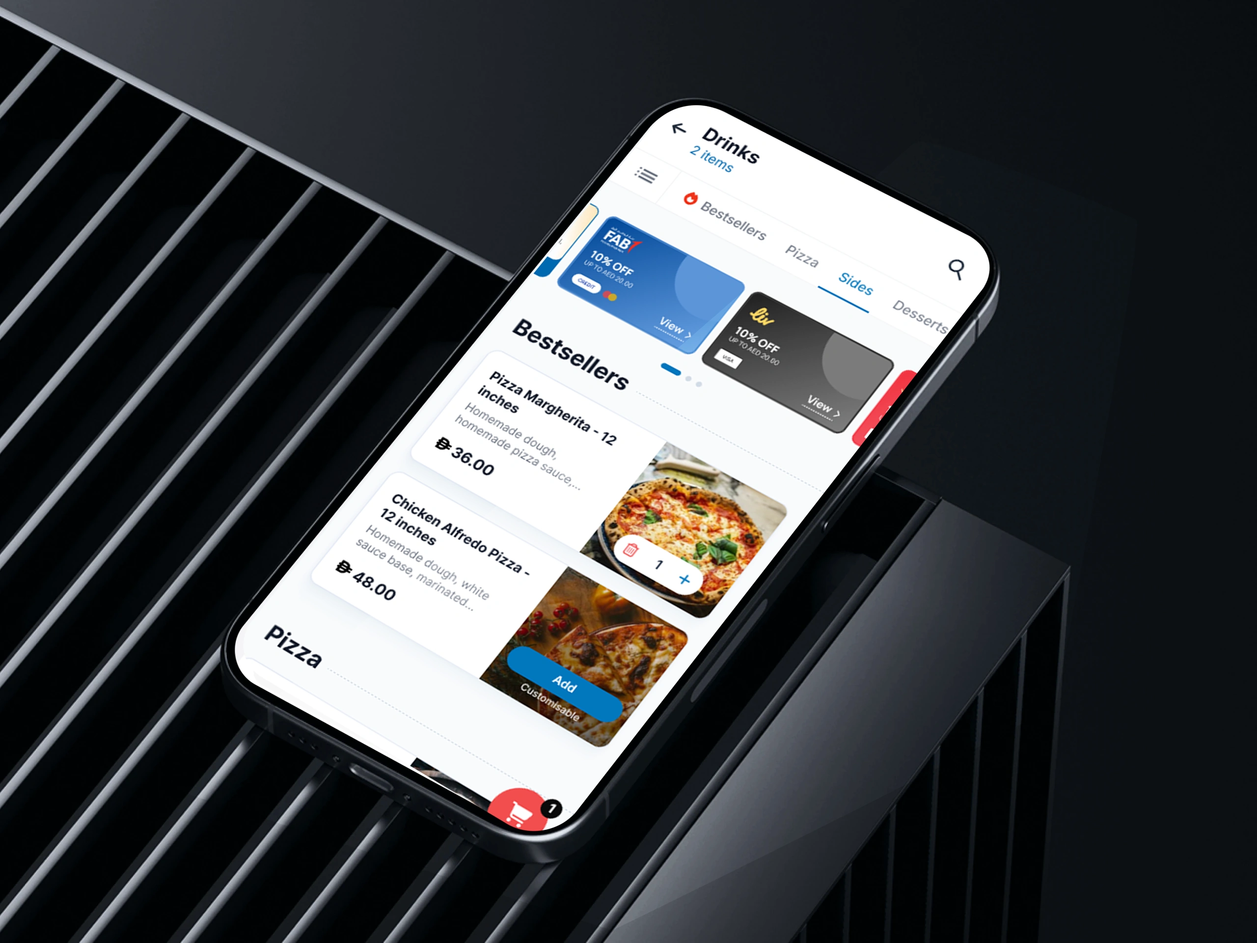
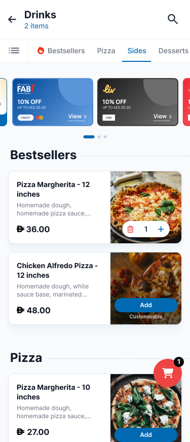
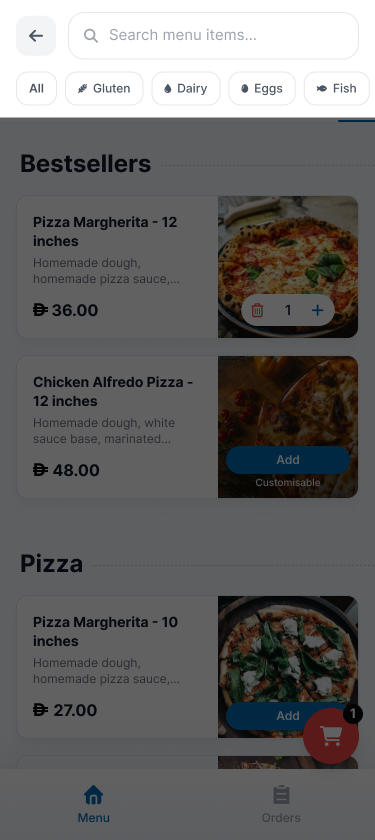
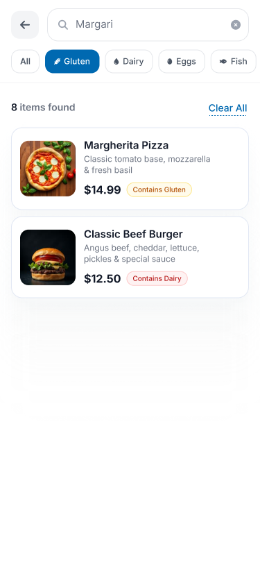
Guests can browse a category, search for an item, or use dietary chips to narrow the list. The item detail provides the context needed to decide.
- Menu discovery: Keep categories and search easy to reach and show price and quantity controls on item cards.
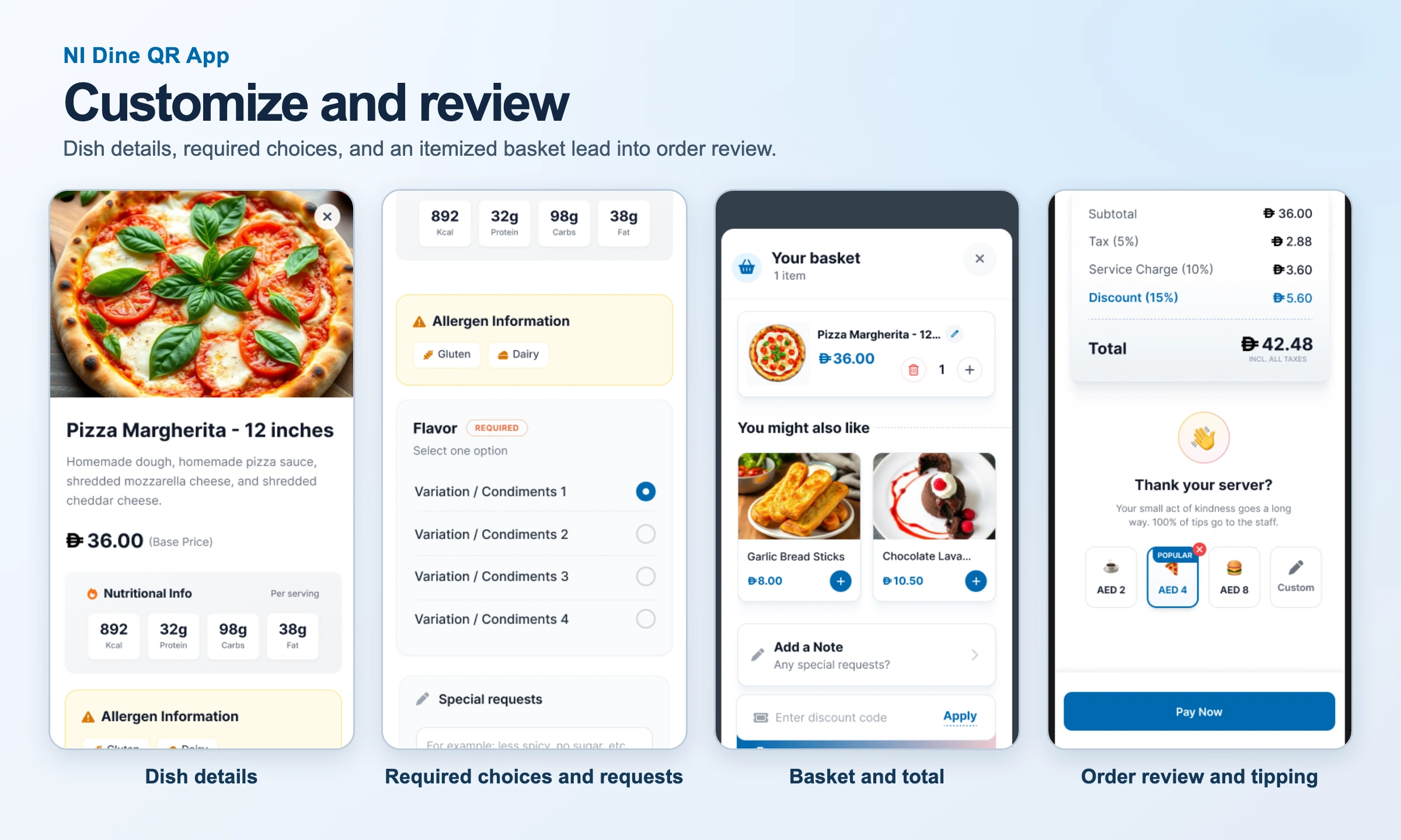
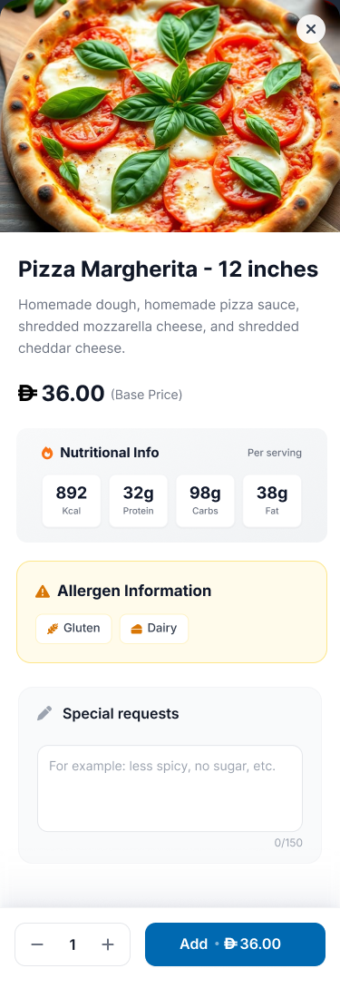
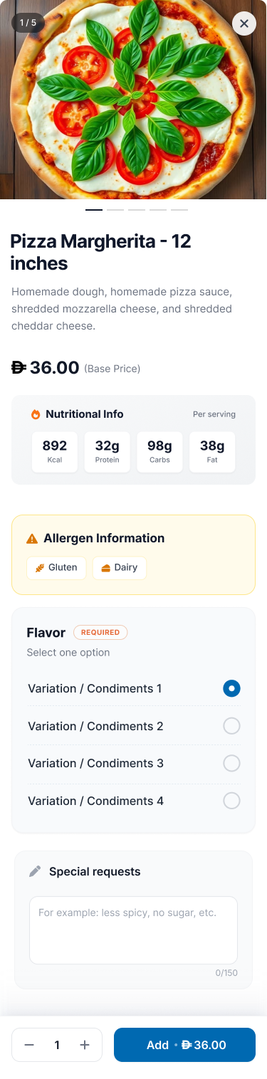
- Dish information: Surface ingredients, nutrition, and allergen labels before the guest adds an item.
- Customization: Make required flavor choices clear and keep special requests and quantities editable.
Review the order before committing
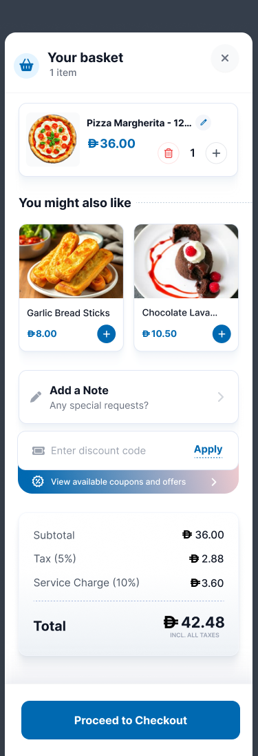
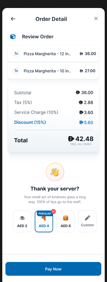
The basket brings item edits, add-ons, notes, and discount entry together. The review screen gives guests one more chance to check what they’re about to pay.
- Basket and totals: Separate the subtotal, fees, and final total so the amount is easy to check.
- Checkout review: Show order items and optional tips before the payment step.
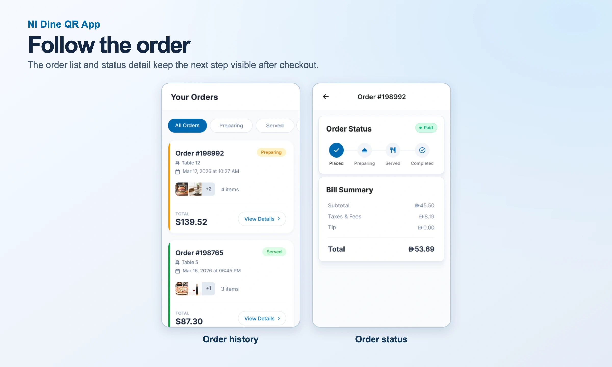
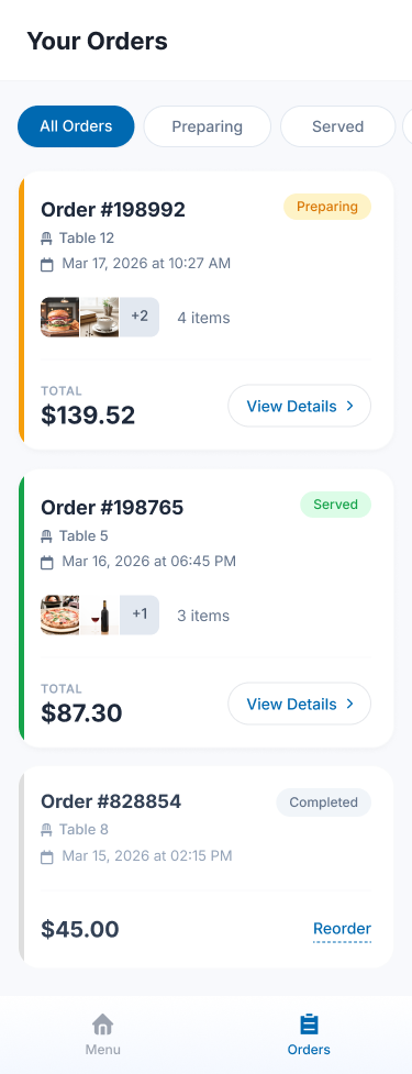
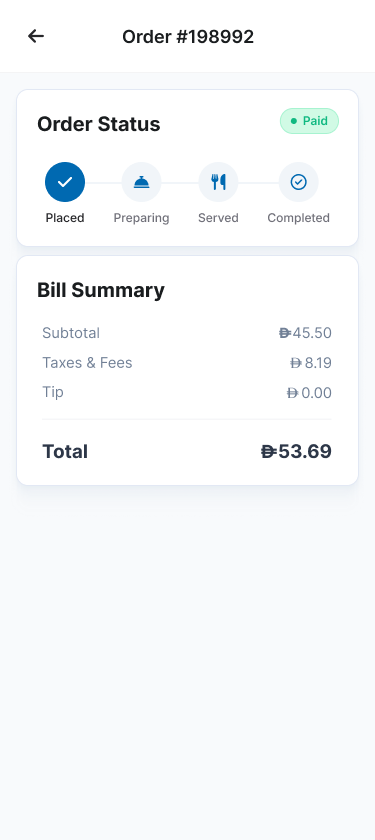
- Order follow-up: Use the order list and status screen to show progress and the associated bill summary.
Inspect individual screens (9)
Find a dish
Customize and review
Follow the order
Pay, split & recover
Review and pay from the table
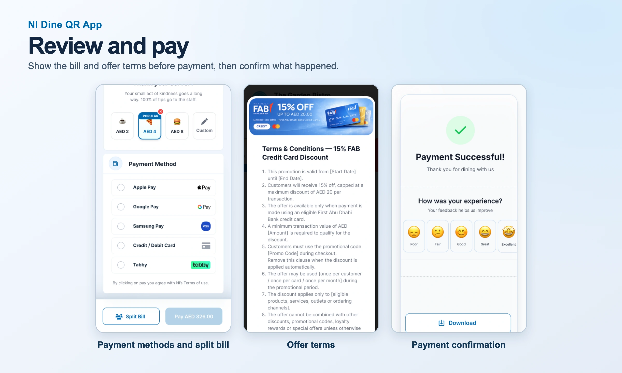
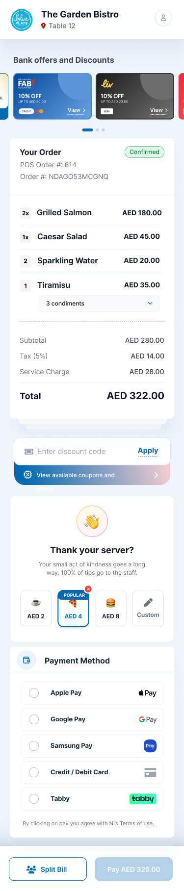
The bill-first path is for a guest who has already ordered. It brings together the confirmed order, charges, payment options, and any applicable offers.
- Itemized bill: Show ordered items, tax, service charge, and the total before the guest selects a method.
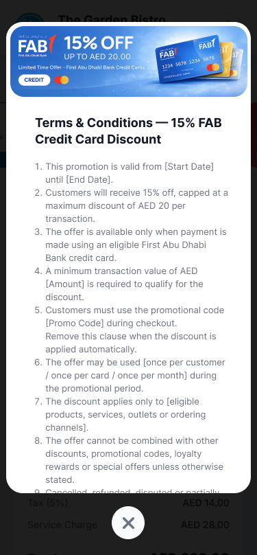
- Offers and tips: Make eligibility and terms available and show the effect of a selected tip or discount before payment.
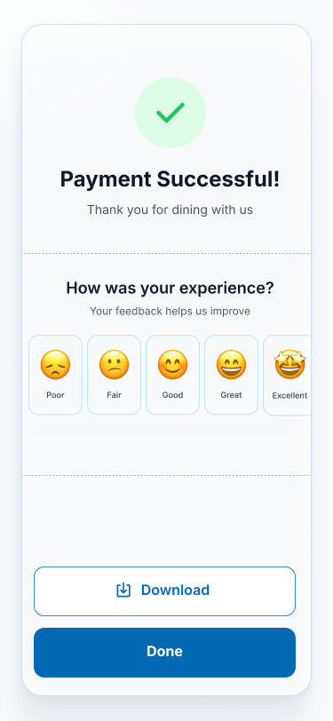
- Payment confirmation: Use a clear success state with feedback, download, and Done actions.
Split the bill and handle interruptions
Group settlement needs a clear amount per guest and a way to see progress. Recovery states explain the problem in plain language and offer an action guests can take.
- Split Bill: Show the guest count and each share before a participant pays.
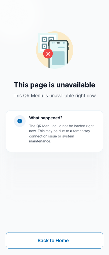
- Missing or unavailable: Distinguish an unopened bill from a connection problem or a QR menu that could not load.
- Payment retry: Let guests try again or choose another method, with a route to staff assistance.