


Why great design isn't about making things look clever, but making everyday experiences feel effortless.
Good UX Is Everywhere. So Is Bad UX.
Have you ever pulled a door that was supposed to be pushed?
Pressed an elevator button twice because you weren't sure it worked?
Or visited a website where you couldn't figure out how to do something that should be simple?
We've all been there.
These are everyday examples of user experience (UX). And they remind us of something important:
Good UX isn't just about beautiful interfaces. It's about making things easy to understand and use.
Steve Krug explained this perfectly in his book Don't Make Me Think. The principle is simple: people shouldn't have to figure out how something works before they can use it.
Let's look at how this applies to real life, digital products, and human psychology.
A Door Shouldn't Need Instructions
Imagine a glass door with a big vertical handle. Naturally, you pull it.
But it doesn't open.
There's a small sign saying "PUSH."
That's bad UX.
The door's appearance suggests one action, but its actual behavior requires another.

The same thing happens in digital products. A button that doesn't look clickable, an unfamiliar icon without a label, or hidden navigation creates unnecessary confusion.
The lesson: Design should communicate what people can do without requiring instructions.
Stop Using Jargon. Speak Like a Human.
One common UX mistake is making simple things sound complicated.
Imagine visiting a banking app and seeing:
"Transaction authorization unsuccessful due to invalid authentication credentials."
What?
Why not simply say:
"We couldn't verify your details. Please check and try again."
Or imagine ordering coffee and the cashier asks:
"Please specify your preferred beverage thermal configuration."
Instead of:
"Hot or iced?"
Sounds ridiculous, right? Yet we do this in websites and applications all the time.
Even designers are guilty of it.
We say "reduce cognitive friction through progressive disclosure" when what we really mean is "show users what they need first, and the rest when necessary."
Technical terminology has its place in professional discussions, but it shouldn't make everyday interactions harder.
The lesson: Your users shouldn't need a dictionary to understand your product. Clear language is good UX.
User Psychology: People Don't Think Like Designers
Here's where UX becomes interesting.
People don't use products the way designers imagine they will.
They scan instead of reading everything. They follow familiar patterns. They get distracted, make mistakes, and usually choose the easiest available path.
Understanding a few psychological principles helps explain why.
Cognitive Load: Don't Overwhelm People
Imagine a restaurant menu with 150 dishes and no categories.
Now imagine the same menu organized into starters, mains, desserts, and drinks.
The options haven't changed, but the second menu is easier to navigate.
That's because organizing information reduces unnecessary mental effort, or cognitive load.
The same applies to dashboards, checkout pages, and mobile apps.
Hick's Law: Too Many Choices Can Slow Decisions
Ever opened a streaming app, spent 20 minutes browsing, and ended up watching nothing?
More options don't always create a better experience.
When people face too many equally plausible choices, deciding can take longer.
Clear categories, useful recommendations, and sensible defaults can make decisions easier.
Mental Models: Familiarity Makes Things Easier
When you see a shopping cart icon, you know what it means.
Imagine replacing it with a creative abstract symbol just to make the design unique.
Now users have to learn what it represents.
People bring expectations from previous experiences. Good design takes advantage of those familiar patterns.
The lesson: Understanding human behavior is more important than making an interface look innovative.
When Technology Makes Simple Things Harder
You sit down at a restaurant and scan a QR code to order.
Instead of seeing the menu, you're asked to register, verify your phone number, enter a table number, and choose whether you're dining in.
You're literally sitting at the table.
Why should you have to tell the system?
Now imagine scanning the code, seeing the menu immediately, selecting your food, and paying.
No unnecessary steps.
That's what good UX should feel like.
The same applies to parking machines, airport check-ins, hospital appointment bookings, and eCommerce websites.
The lesson: Making something digital doesn't automatically make it better. Technology should remove friction, not introduce more of it.
Psychology Also Explains Why Trust Matters
Imagine transferring money through a banking app.
You enter the amount and recipient details, then see a button labeled "Submit."
Submit what? Will the money transfer immediately? Are there additional fees?
Now imagine a confirmation screen showing the recipient, amount, fees, and a clear "Confirm Transfer" button.
That feels more reassuring.
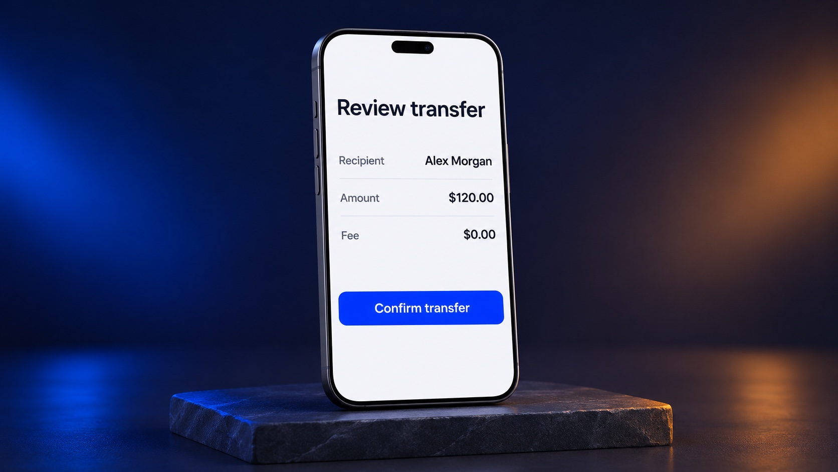
People aren't just completing tasks. They're also managing uncertainty, expectations, and perceived risk.
A clear confirmation, transparent pricing, or helpful error message can make a big difference.
The lesson: Good UX doesn't just make things easier. It helps people feel confident about their decisions.
Simple Doesn't Always Mean Minimal
There's a misconception that good UX means fewer buttons, less text, and more whitespace.
But a clean-looking interface can still be difficult to use.
Sometimes, removing labels creates confusion. Sometimes, adding an explanation prevents a mistake.
Think about an airport.
Would removing half the directional signs make it look cleaner?
Probably.
Would it make navigating easier?
Definitely not.
Simplicity isn't about removing everything. It's about keeping what people actually need.
The Real Role of a Product Designer
After years of working on digital products, eCommerce platforms, and complex user journeys, I've learned that great UX often starts with a few simple questions:
- Can someone understand this without an explanation?
- Are we using language people naturally understand?
- Are we asking for information the system already knows?
- Does the next step feel obvious?
- What happens if someone makes a mistake?
- Are we solving a real problem or just adding another feature?
These aren't complicated questions.
But they can reveal problems that beautiful UI mockups won't.
And while common sense is a useful starting point, it isn't a substitute for user research. What feels obvious to a designer might not feel obvious to the actual customer.
Final Thought: Great UX Just Makes Sense
The best user experience isn't necessarily the one with the most advanced technology, the fanciest animations, or the most innovative interface.
It's the one that understands people.
Their habits. Their expectations. Their frustrations. Their psychology.
Sometimes, improving UX means removing a step. Sometimes it's changing a confusing label. And sometimes it's simply asking why something needs to be complicated in the first place.
As product designers, our job isn't to make users think about how clever our design is. It's to help them accomplish what they came to do without thinking about the interface.
Because the best compliment a user can give your design isn't "Wow, this looks amazing."
It's something much simpler.
"That was easy."
Vinzmedia — Connecting business goals with user needs through product design.
