As digital product organizations scale past dozens of cross-functional squads, design systems frequently collapse under their own weight. Either the system becomes overly rigid—forcing teams to create rogue forks—or it becomes too permissive, resulting in fragmented visual sprawl.
01 // Three-Tier Token Architecture
The solution lies in decoupling aesthetic definitions from component implementations through a strict three-tier token hierarchy:
- Global Tokens: Raw color values, typography scales, bezier easings, and elevation matrices (e.g.,
color-cyan-500: #06b6d4). - Semantic Tokens: Purpose-driven variables mapped to context (e.g.,
surface-accent-primary: var(--color-cyan-500)). - Component Tokens: Scoped variables assigned to discrete UI elements (e.g.,
button-primary-bg: var(--surface-accent-primary)).
02 // Fluid Ergonomics on Modern Displays
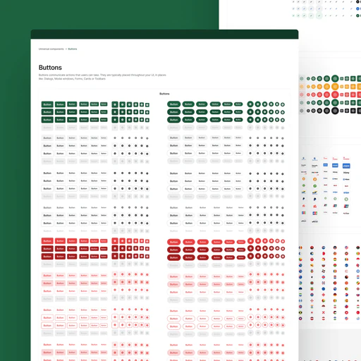
Fixed pixel break-points are increasingly inadequate for modern hardware spanning foldable phones, ultra-wide curved monitors, and spatial headsets. By leveraging CSS clamp functions keyed to viewport container units, typography scales and button geometries dynamically adjust with zero breakpoint jumping.
“A robust design system does not restrict creativity; it removes redundant decisions so teams can focus on customer problems.”